Info
Dreaming of going underground can symbolize a journey to the subconscious, or it can mean that the dreamer is wrestling with issues he or she is afraid to face. In addition, venturing underground during a dream can mean the dreamer is ready to explore previously hidden issues.

- XOOPS Cube, 8th Dec, 2007
- A (des)vantagem do egoísmo
- a tragedia dos bens comuns
- sunday-lab: Programers' activity without programin...
- Nova comunidade sobre o XOOPS Cube
- xpWiki Ver 3.37 previously SQL Injection vulnerabi...
- Baixe a ultima traducao do XOOPS Cube Legacy
- xoops modulo protector
- contas de email gratis
- XOOPS Cube em Portugues

- 20000102
- 20001209
- 20030201
- 20040404
- 20041001
- 20041101
- 20051206
- 20061119
- 20061120
- 20061207
- 20061229
- 20061230
- 20070101
- 20070201
- 20070301
- 20070501
- 20070605
- 20070701
- 20070801
- 20070902
- 20070903
- 20070904
- 20070905
- 20070906
- 20070907
- 20070909
- 20070910
- 20070911
- 20070912
- 20070913
- 20070914
- 20070924
- 20071012
- 20071018
- 20071018
- 20071101
- 20071107
- 20071109
- 20071111
- 20071112
- 20071113
- 20071114
- 20071115
- 20071118
- 20071119
- 20071129
- 20071204
- 20071206
- 20071207
- 20071208
dimanche 18 novembre 2007
contas de email gratis
SharpmailE se lhe enviassem um mail com remetente da Casa Real Espanhola? Pois era engano, bem visto ;-), mas podemos experimentar engendrar um esquema que o faça, este é o propósito do Sharpmail. Podemos mascarar o remetente com falsos endereços, utilidade muito pouca, fica a sugestão para diversão.
Temporary Inbox
Podemos ter urgência em colocar um endereço, mas não estamos na disposição de ter de apagar futuras mensagens do sitio onde nos registamos, um e-mail tipo chiclete era bem visto. Assim podemos usar os serviços gratuitos do Temporary Inbox, usa e deita fora… 6 horas depois!
Intersix
Quer um e-mail secreto? Daqueles que passa de fininho pelos servidores sem que dêem por ele? O e-mail passa por um canal protegido, onde é codificado com uma senha criada pelo remetente. A mensagem fica depois guardada no servidor até ao momento em que o destinatário a descarrega para o seu computador. O destinatário consegue abrir o e-mail através da senha que o remetente envia por telefone ou via SMS. Serviço brasileiro da Intersix.
Kablooey
Mas secreto secreto só se for tipo Mission Impossible!!! Esta mensagem será destruída em 30 segundos. Esta é a proposta da Kablooey, o cibernauta utiliza a área de mensagens por mail, escreve o seu texto secreto, este é enviado ao destinatário que tem 30 segundos para o ler, depois disso verá a mensagem implodir. Se não fosse online tinha a sua piada!
Jetable
E um e-mail só por um dia? Claro que sim. Neste serviço da Jetable local podemos configurar um mail que apenas está em vigor por 24 horas. Até dá jeito por vezes, principalmente quando queremos receber a "key" para um determinado programa funcionar, mas não queremos que nos enviem constantemente Spam.
10 Minute Mail
O Vítor, meu homónimo, referiu o 10 Minute Mail. Esta solução permite entregar e receber correio naquele endereço durante apenas 600 segundo, 10 minutos ![]()
Tempinbox
A sugestão do Rafael é para um serviço interessante. Tempinbox é um serviço de correio, apenas para receber, mais simples acho que não há, vamos ao site Tempinbox, na caixa de escolha do mail definimos o prefixo que nos identificará, ex. lolllllada36958@tempinbox.com depois na página seguinte escolhemos como queremos receber o nosso mail, isto é, escolhemos o serviço RSS por onde nos chegará a correspondência. Super simples e eficaz, quanto mais improvável for o prefixo menos hipóteses têm de receber SPAM.
Mailinator
É um serviço bastante conhecido no âmbito das caixas de correio descartáveis. O Pedro Duarte enviou-nos esta sugestão afirmando que é um serviço rápido, sem password, sem registo. O ideal é escolher um prefixo estranho do tipo qualquercoisa6969@@mailinator.com. Mailinator é um solução para o imediato, receber, ler e deitar fora.
GuerillaMail
Para quem precisar de um mail só para 15 minutos, e à imagem de outros que já falamos temos o GueillaMail. Tem exactamente 15 minutos, depois disso desaparece todo o conteúdo da mensagem. Obrigado João Pedro.
Dontreg
Email temporário que oferece 4MB de espaço e que gere eficazmente mensagem SPAM. Tem dois dias para ler as mensagens, se não as apagar passados 2 dias serão eliminadas pelo serviço. Dontreg é muito simples de criar.
BugMeNot
Este serviço está dedicado aquelas páginas que exigem um mail para futuramente enviar informações. Usam a primeira vez para validarem um determinado serviço e posteriormente carregam-nos com toneladas de informações que dispensamos bem. BugMeNot é uma solução para não voltar a ser incomodado. Tem no máximo 24 horas para ter acesso à correspondência, depois mais nada cairá nessa caixa.
WH4F
O Will Hack For Food disponibiliza email temporário de 8 horas, 1, 2, 4 ou 7 dias. Cada conta tem um limite de 10 mensagens, 1MB por mensagem. Caso ultrapasse este limite serão removidas as mensagens mais antigas.
MyTrashMail
O MyTrashMail permite-lhe criar um email temporário com ou sem password. Para usar vamos até à página principal, escolhemos uma das modalides e digitamos o e-mail pretendido. Tenha em atenção que as contas seguras (protegidas por password) começam obrigatoriamente por "me.", ex.: ppl2007ware@mytrashmail.com ou, no caso de ser protegido, me.ppl2007ware@mytrashmail.com. O limite de espaço é de 4MB, 2 por mensagem de e-mail, que estará disponível num prazo de 12 horas a 5 dias.
SpamHole
O SpamHole é mais um serviço de e-mail temporário que lhe dá uma conta algumacoisa@spamhole.com por um prazo máximo de 72 horas.
TempoMail
O TempoMail é um serviço originalmente francês que lhe permite enviar e receber email com uma conta temporária. Basta introduzir o tempo que deseja que a conta dure e esta é criada automaticamente, com letras aleatórias. Para uma maior comodidade, o TempoMail oferece ainda uma extensão para o Mozilla Firefox.
SpamBox
O SpamBox foi um dos poucos serviços que me direccionou automaticamente para uma tradução em português. Assim, passo a citar: Com este serviço, podes criar a tua caixa temporária de e-mail que irá reencaminhar todos os emails para a tua caixa de e-mail usual. Simplesmente introduz a tua caixa de email e o tempo de duração da caixa temporária nós iremos gerar-te uma caixa de e-mail temporária @spambox.us.
TemEMail
O TempEMail dá-lhe uma caixa de correio electrónico descartável, sem registo, só para receber. Basta abrir o site e introduzir o nome da conta da qual quer verificar os emails. Fácil não?
MailEater
Tal como o TempEMail, no MailEater basta introduzir o nome da conta e começar a ler. Sem registo e só para receber! Todas as contas são do tipo algumacoisa@maileater.com.
Spam.la
Semelhante aos últimos dois. A diferença é que o Spam.la mostra um índice de todas as mensagens recebidas, por todas as contas @spam.la. É claro, pode sempre filtrá-las e ler as mensagens de uma só conta.
FakedEmail
Para terminar em beleza, um serviço nacional. O FakedEmail é mantido por Daniel Martins e cria contas descartáveis que estão apenas disponíveis enquanto mantiver o site aberto no seu navegador. A conta é automaticamente criada mas, se não lhe agradar, pode escolher algo como eujafui@fakedemail.com. Ainda está em desenvolvimento, mais funções esperam-se para breve.
Já sabem, esperamos continuar receber mais sugestões para adicionar aqui. Por email ou nos comentários, não deixem de partilhar os vossos conhecimentos!
Libellés : email, free, hacking, info, ip, mail, underpop.online.fr
publié par mikhail | dimanche, novembre 18, 2007 | 0 commentaires, Liens vers ce message blog,
mercredi 14 novembre 2007
Link Extractor
| Link Extractor | |||
This tool will enable you to extract links from a specific web page with associated anchor text, HTML code, attributes and Google pagerank.  |
|||
|
Libellés : alexa, how traffic rank works, info, iwebtool, php, traffic rank
publié par mikhail | mercredi, novembre 14, 2007 | 0 commentaires, Liens vers ce message blog,
.siteadvisor.de
underpop.online.fr

We tested this site and didn't find any significant problems.
Libellés : hiperlinking, info, webmasters
publié par mikhail | mercredi, novembre 14, 2007 | 0 commentaires, Liens vers ce message blog,
iwebtool.com
|
|
||||||||||||||||||||||||||||||||||||||||||||||||||||||||||||||||||||||||||||||||||||||||||||||||||||||||||||||||||||||||||||||||||||||||||||||||||||


Libellés : how traffic rank works, info, iwebtool, php, traffic rank, webmasters
publié par mikhail | mercredi, novembre 14, 2007 | 0 commentaires, Liens vers ce message blog,
mardi 13 novembre 2007
my ip neighbors
- http://1prise2tetes.online.fr
- http://5lair.online.fr
- http://a.cycliste.gassinois.online.fr
- http://a.gaudin.online.fr
- http://a.ttfr.online.fr
- http://a2p.online.fr
- http://aanthill.online.fr
- http://accescanin.online.fr
- http://acdieppe.online.fr
- http://achachichou.online.fr
- http://aebsoft.online.fr
- http://ahuh.online.fr
- http://aider.chinchins.online.fr
- http://aigle05.online.fr
- http://ajcr.online.fr
- http://akryls.online.fr
- http://akwabatheatre.online.fr
- http://alerions.online.fr
- http://alex.bourg.online.fr
- http://alexandre.delan.online.fr
- http://alexflam.online.fr
- http://alp2m.online.fr
- http://alphapage.online.fr
- http://alpimages.online.fr
- http://alveole.online.fr
- http://am06.online.fr
- http://amas.online.fr
- http://amicale.puch.online.fr
- http://amv.online.fr
- http://ana.mihai.online.fr
- http://anarkoi.online.fr
- http://angalys.online.fr
- http://angelcat.online.fr
- http://angestudio.online.fr
- http://anjou.domicile.online.fr
- http://anoril.online.fr
- http://anrf.paris.online.fr
- http://antarctica.online.fr
- http://anthonychamas.online.fr
- http://antoine.salvi.online.fr
- http://antoinelucas.online.fr
- http://arbosedelle.online.fr
- http://archersdeperols.online.fr
- http://archilibre.online.fr
- http://archsubgras.online.fr
- http://ardennes44.online.fr
- http://arisme.online.fr
- http://armelle.gourlaouen.online.fr
- http://arn.gui.online.fr
- http://arpcv.online.fr
- http://arthemisia.online.fr
- http://asalm.online.fr
- http://ashuu.online.fr
- http://asignoret.online.fr
- http://askelo.online.fr
- http://asmv.online.fr
- http://assier.festival.online.fr
- http://asso.aleph.online.fr
- http://associationtournesol.online.fr
- http://astrim.online.fr
- http://atlanticpokerclub.online.fr
- http://aubade.quercy.online.fr
- http://aubrac48.online.fr
- http://autour.du.monde.online.fr
- http://aviron.club.soustons.online.fr
- http://avm.online.fr
- http://avm.online.fr
- http://ayou.online.fr
- http://azrou.online.fr
- http://b.bello.online.fr
- http://baraikido.online.fr
- http://barsa.online.fr
- http://bassite.online.fr
- http://bbso.online.fr
- http://bdafe.online.fr
- http://bdplus.online.fr
- http://beezz.online.fr
- http://bellac.online.fr
- http://bellcatherine.online.fr
- http://benedicte.moisset.online.fr
- http://benjamin.duboc.online.fr
- http://bergerie.pyrenees.online.fr
- http://bga.asso.online.fr
- http://bgkdel.online.fr
- http://bhsoh.online.fr
- http://bib.quoideneuf.online.fr
- http://bigouden.blues.online.fr
- http://blaise.buscail.online.fr
- http://bone.breaker.online.fr
- http://boun.online.fr
- http://brasov.online.fr
- http://broderieveronique.online.fr
- http://bulles100contours.online.fr
- http://c.antoine.online.fr
- http://c.panel.online.fr
- http://cabrijava.online.fr
- http://cacteus.online.fr
- http://caf77.online.fr
- http://cail.online.fr
- http://cambremer.online.fr
- http://cameleon.assoc.online.fr
- http://cameraman.online.fr
- http://campingdustade.online.fr
- http://capde.online.fr
- http://capsais.online.fr
- http://carroline.hazard.online.fr
- http://cathedrale.toulouse.online.fr
- http://cathycreatif.online.fr
- http://catreims.online.fr
- http://cavec.online.fr
- http://cdaa.online.fr
- http://cdck.62.online.fr
- http://cddr.online.fr
- http://cdeval.online.fr
- http://cdri.lyon.online.fr
- http://ceavgsq.online.fr
- http://cedre.forum.online.fr
- http://cela.etant.online.fr
- http://cercle.babylon5.online.fr
- http://cerfs.online.fr
- http://cgtptt.online.fr
- http://chabin.laurent.online.fr
- http://chambinator.online.fr
- http://champagnesc.online.fr
- http://chateaudevie.online.fr
- http://chdpeintre.online.fr
- http://cherchemail.online.fr
- http://ches.diseux.online.fr
- http://chez.popai.online.fr
- http://chiboum.online.fr
- http://christian.caleca.online.fr
- http://christian.nicollet.online.fr
- http://christian.ohn.online.fr
- http://christian.zussy.online.fr
- http://christophe.fleury.online.fr
- http://christophe.lenoble.online.fr
- http://christopheblanc.online.fr
- http://chticonnection.online.fr
- http://chticonnection.online.fr
- http://cine.lycee.online.fr
- http://ciramtoulon.online.fr
- http://circuit.thailande.online.fr
- http://claude.quettier.online.fr
- http://claude.tournon.online.fr
- http://clicweb.online.fr
- http://clinamen.online.fr
- http://clonecast.online.fr
- http://club.ulm.st.lieux.online.fr
- http://cmdl.online.fr
- http://comuweb.online.fr
- http://concert.rock.online.fr
- http://coolhackers.online.fr
- http://cornelia.black.online.fr
- http://corrsside.online.fr
- http://corsica.is.online.fr
- http://coteazur.online.fr
- http://creaturesfrance.online.fr
- http://culturalvibes.online.fr
- http://cv.sanguinet.online.fr
- http://cyril.gauthey.online.fr
- http://cza.online.fr
- http://damsnet.online.fr
- http://dan.inger.online.fr
- http://danseorientale.online.fr
- http://danseseniledefolk.online.fr
- http://darkaldar.online.fr
- http://david.alleysson.online.fr
- http://davyke.online.fr
- http://dawnofwar.online.fr
- http://dblandimages.online.fr
- http://dede.furet.online.fr
- http://deege.online.fr
- http://denis.corbin.online.fr
- http://deperett.cpl.online.fr
- http://desastres.online.fr
- http://destinationbloc.online.fr
- http://dhuc.online.fr
- http://didier.lefevre.online.fr
- http://didier.pa.online.fr
- http://djpierre.online.fr
- http://djstorminnorm.online.fr
- http://dolphyns.online.fr
- http://dom78.online.fr
- http://dombsite.online.fr
- http://dr.jones.online.fr
- http://dracotom.online.fr
- http://dragonballz.online.fr
- http://dunesdeflandre.online.fr
- http://duvent.online.fr
- http://dvdhificinema.online.fr
- http://e.maillet.online.fr
- http://e.maillet.online.fr
- http://ebambs.online.fr
- http://ecole.cravanche.online.fr
- http://ecolesagesse.online.fr
- http://ecsel.online.fr
- http://edaleine.online.fr
- http://eeudf.baslanguedoc.online.fr
- http://elizabeth.schaefer.online.fr
- http://enigmej.online.fr
- http://entwane.online.fr
- http://erikw.online.fr
- http://ermitage.stmarcel.online.fr
- http://esperanto.jeunes.online.fr
- http://euclide.euclide.online.fr
- http://eurekaweb.online.fr
- http://extmusic.online.fr
- http://extmusic.online.fr
- http://f.coince.online.fr
- http://f.rosolato.online.fr
- http://f1afz.online.fr
- http://facileweb.online.fr
- http://fairesonpain.online.fr
- http://faithlee.online.fr
- http://familip.online.fr
- http://fansdescitesdor.online.fr
- http://fbr.online.fr
- http://felis.7.online.fr
- http://festivaldolt.online.fr
- http://ffmf.nord.online.fr
- http://filetsbleus.online.fr
- http://flayeart.online.fr
- http://flepiol.online.fr
- http://flevrier.online.fr
- http://flipper.pinball.online.fr
- http://flte.online.fr
- http://foostine.online.fr
- http://fr32c.online.fr
- http://franciscains.online.fr
- http://franclr.online.fr
- http://fredomkb.online.fr
- http://frisbeurs.online.fr
- http://frutch.online.fr
- http://fsamblat.online.fr
- http://funivers.online.fr
- http://g.facon.online.fr
- http://gaming.zone.online.fr
- http://gamm.online.fr
- http://gaogoa.online.fr
- http://gaulliste.online.fr
- http://geckopalace.online.fr
- http://gelstat.online.fr
- http://generikz.online.fr
- http://genev.online.fr
- http://genevoute.online.fr
- http://gensac.online.fr
- http://geologix.online.fr
- http://georges.turrroques.online.fr
- http://gespoirasso.online.fr
- http://ghetto.blasterk.online.fr
- http://gizmoatwork.online.fr
- http://gmolter.online.fr
- http://gnome99.online.fr
- http://gogonel.online.fr
- http://goualard.online.fr
- http://gpoulain.online.fr
- http://grandklezmer.online.fr
- http://great.rabbit.online.fr
- http://gtv.web.online.fr
- http://gugusite.online.fr
- http://hammamet.online.fr
- http://handballvendee.online.fr
- http://hippo.hoerdt.online.fr
- http://hlucile.online.fr
- http://homoedu.online.fr
- http://homozygote.online.fr
- http://hot.chili.online.fr
- http://humanafterall.online.fr
- http://humans.are.online.fr
- http://humanum.online.fr
- http://humou.online.fr
- http://ice.breaker.online.fr
- http://ifhe.online.fr
- http://ifm.online.fr
- http://imothep69.online.fr
- http://infodisque.net.online.fr
- http://infos.radars.online.fr
- http://innover.online.fr
- http://intersyndicale.anim.online.fr
- http://intheclub.online.fr
- http://isabellelega.online.fr
- http://itsas.mendi.online.fr
- http://ja.fretin.online.fr
- http://jack.sigurson.online.fr
- http://jag.de.bellouet.online.fr
- http://jamescoates.online.fr
- http://januelfx.online.fr
- http://jazzubaye.online.fr
- http://jbcqvf.online.fr
- http://jbdumora.online.fr
- http://jc.michel.online.fr
- http://jdepetris.online.fr
- http://jean.dif.online.fr
- http://jean.philippe.paul.online.fr
- http://jeanphilippe.boin.online.fr
- http://jeetcenter2003.online.fr
- http://jef.perroy.online.fr
- http://jerobonato.online.fr
- http://jitka.online.fr
- http://jlhb.online.fr
- http://jmg11.online.fr
- http://jmregnier.online.fr
- http://joelemerou.online.fr
- http://jphgoude.online.fr
- http://jtourneux.online.fr
- http://judith.cotelle.online.fr
- http://judo.maze.online.fr
- http://julien.dubois.online.fr
- http://julien.heidmann.online.fr
- http://justesev.online.fr
- http://kagyu.cerences.online.fr
- http://kakdesign.online.fr
- http://kalie2702.online.fr
- http://katatonie.online.fr
- http://kerovpyan.online.fr
- http://khamphou.sengsouvanh.online.fr
- http://kir4ppy.online.fr
- http://kiwanis.oyonnax.online.fr
- http://kkbf.online.fr
- http://knox.ac.online.fr
- http://krettly.yves.online.fr
- http://krist.online.fr
- http://kyoto.japon.online.fr
- http://l.pawlowski.online.fr
- http://labo.assoc.online.fr
- http://labragelogniere.online.fr
- http://lafarfelue.online.fr
- http://lafermeadede.online.fr
- http://laissezlesvivre.online.fr
- http://lamaisonacousmate.online.fr
- http://lamnoir.online.fr
- http://laos.luangprabang.online.fr
- http://lareinecleo.online.fr
- http://lasacoche.online.fr
- http://lassauge.online.fr
- http://lastrada.online.fr
- http://lateamrdj.online.fr
- http://lateteaucarre.online.fr
- http://latinardiere.online.fr
- http://laurencesaunois.online.fr
- http://laurenrodz.online.fr
- http://laurent.brett.online.fr
- http://laurent.cruel.online.fr
- http://lebadminton.online.fr
- http://lefebvre.sylvain.online.fr
- http://lemalstudios.online.fr
- http://lepm.online.fr
- http://leseclats.online.fr
- http://leserment.online.fr
- http://lesmarcels.online.fr
- http://lespetitescours.online.fr
- http://lesterrassesdulac.online.fr
- http://lestiramisus.online.fr
- http://lesvieillesgloires.online.fr
- http://liberman.online.fr
- http://lilileine.online.fr
- http://limousinvollibre.online.fr
- http://lise.lemahieu.online.fr
- http://livetoride.online.fr
- http://locafly.online.fr
- http://localhero.online.fr
- http://longwyville.online.fr
- http://looniz.online.fr
- http://louis.balmet.online.fr
- http://loustics.europe.online.fr
- http://lta4p.online.fr
- http://luc.adolphe.online.fr
- http://lunamoon.online.fr
- http://lwdr.online.fr
- http://m.jbmpiana.online.fr
- http://maclovers.online.fr
- http://maitre.cles.online.fr
- http://makassar.online.fr
- http://mamdouh.bahri.online.fr
- http://marc.simeon.online.fr
- http://marielyse.schuurman.online.fr
- http://marquant.frederic.online.fr
- http://martini.gilles.online.fr
- http://martod.online.fr
- http://marylb.online.fr
- http://mattjsa.online.fr
- http://maudit.online.fr
- http://mediamomes.parisud.online.fr
- http://mehdi.rabah.online.fr
- http://melut.online.fr
- http://mesjacks.online.fr
- http://metiers.online.fr
- http://michel.galligani.online.fr
- http://mieux.apprendre.online.fr
- http://mimiart.online.fr
- http://minocars.online.fr
- http://mirecourt.online.fr
- http://misomosi.online.fr
- http://mmdupuy.online.fr
- http://mnmsfrance.online.fr
- http://modlet.online.fr
- http://monoski.lateralus.online.fr
- http://monref.online.fr
- http://moulindelarte.online.fr
- http://mucoblog.online.fr
- http://musique.gnawa.online.fr
- http://mystikprod.online.fr
- http://nadx.online.fr
- http://nanbara.online.fr
- http://nano.online.fr
- http://narbouk.online.fr
- http://ncis.team.online.fr
- http://ndeloof.online.fr
- http://nekofan.online.fr
- http://netjohn.online.fr
- http://newsitinfo.online.fr
- http://nhai.online.fr
- http://nicebalboaexchange.online.fr
- http://nicolar.online.fr
- http://nicolas.goffard.online.fr
- http://nihon.furansu.online.fr
- http://nilo.stolte.online.fr
- http://noblebeuz.online.fr
- http://nok99.online.fr
- http://nokadcommunication.online.fr
- http://noos.online.fr
- http://nopacnone.online.fr
- http://nosdestinations.online.fr
- http://nossaraj.online.fr
- http://nouflon.online.fr
- http://nriv.online.fr
- http://nuitdesdechets.online.fr
- http://oceanos83.online.fr
- http://ofaurax.online.fr
- http://olivier.palombi.online.fr
- http://olivier.quenechdu.online.fr
- http://omeps.online.fr
- http://ons.huis.online.fr
- http://openproject.online.fr
- http://optivol.online.fr
- http://orchidees05.online.fr
- http://organa2000.online.fr
- http://orlandonline.online.fr
- http://oslinux.online.fr
- http://ottdesign.online.fr
- http://ouais.ouais.online.fr
- http://pallando.online.fr
- http://panikhead.online.fr
- http://paplove.online.fr
- http://parenbouge.online.fr
- http://pascalroche.online.fr
- http://patients.impatients.online.fr
- http://patrick.fermi.online.fr
- http://pauline.ruhl.online.fr
- http://peanutsprod.online.fr
- http://pema.yang.dzong.online.fr
- http://penserenjava.online.fr
- http://percy.online.fr
- http://perigord.neuvic.online.fr
- http://phil.hubert.online.fr
- http://philonnet.online.fr
- http://photo.art.fermin.online.fr
- http://photos.andelys.online.fr
- http://pierre.campion2.online.fr
- http://pierre.coutreau.online.fr
- http://pingou1.online.fr
- http://pixeye.online.fr
- http://pjb.maillard.online.fr
- http://pjeantaud.online.fr
- http://plusriensansnous.online.fr
- http://plvw.online.fr
- http://pm95.online.fr
- http://pnau.online.fr
- http://poesiexpo.online.fr
- http://pokeralille.online.fr
- http://prairial.online.fr
- http://praycastel.online.fr
- http://pulsart.online.fr
- http://punkerzz.online.fr
- http://qub.online.fr
- http://queenrock.online.fr
- http://radiocinema.online.fr
- http://radiotelevision.online.fr
- http://radiotrance.online.fr
- http://rando.passion.online.fr
- http://ratbone.online.fr
- http://raymond.iss.online.fr
- http://rcvhandball.online.fr
- http://regis.moulu.online.fr
- http://remi.hamel.online.fr
- http://reve.roche.online.fr
- http://revelry.online.fr
- http://rhcprock.online.fr
- http://riadaguerzame.online.fr
- http://rmitte.online.fr
- http://ro2v.online.fr
- http://road27.online.fr
- http://rodolphe.roche.online.fr
- http://roger.rapeau.online.fr
- http://rollerloisirs.online.fr
- http://ronde.carnaval.online.fr
- http://rondel.mickael.online.fr
- http://roses.guide.online.fr
- http://rousseaub.online.fr
- http://rpgbabylon5.online.fr
- http://rvince.online.fr
- http://s.sudre.online.fr
- http://s.w.c.carcans.online.fr
- http://saint.nizier.online.fr
- http://sainte.bernadette.online.fr
- http://sainteagnes.online.fr
- http://salukis.online.fr
- http://sandsroses.online.fr
- http://scavengours.online.fr
- http://scenac.online.fr
- http://schv.online.fr
- http://scythe.online.fr
- http://sd.handball.online.fr
- http://sebastien.portebois.online.fr
- http://sebastien.sajous.online.fr
- http://sebhien.online.fr
- http://sergeimbott.online.fr
- http://sevens.online.fr
- http://sexysylvie.online.fr
- http://sfoliard.online.fr
- http://shanarah.online.fr
- http://sheliyah.online.fr
- http://shootart.online.fr
- http://sib.online.fr
- http://sidonie9.online.fr
- http://sinatra.online.fr
- http://sitcorem.online.fr
- http://ski.handisport.online.fr
- http://skinautiqueinfo.online.fr
- http://skydanceshow.online.fr
- http://slimaneaniss.online.fr
- http://smbsharescan.online.fr
- http://sncf.online.fr
- http://socialisme.online.fr
- http://sokol.online.fr
- http://sonart.online.fr
- http://soulandia.online.fr
- http://spa.cognac.online.fr
- http://specqueux.online.fr
- http://squarefrance.online.fr
- http://sref.online.fr
- http://st.philbert.gd.lieu.online.fr
- http://starm.online.fr
- http://stivoli.online.fr
- http://subalien.online.fr
- http://swift.boomerang.online.fr
- http://tceragny.online.fr
- http://teamplanning.online.fr
- http://tennis3000.online.fr
- http://terra000.online.fr
- http://terrot.dijon.online.fr
- http://th.rock.online.fr
- http://the.shadock.online.fr
- http://thefloydmuseum.online.fr
- http://thegoldlionsstudio.online.fr
- http://thiefaine.online.fr
- http://thierry.stora.online.fr
- http://thierryniang.online.fr
- http://thiery06.online.fr
- http://thomas.mansi.online.fr
- http://thomeryvtt.online.fr
- http://tmtm.online.fr
- http://tntworld.online.fr
- http://toma.d.online.fr
- http://tonfa.online.fr
- http://tony.dumoulin.online.fr
- http://tour.du.monde.online.fr
- http://toweld.online.fr
- http://trackers.online.fr
- http://trevesse.online.fr
- http://trioarpeggio.online.fr
- http://trollmetender.online.fr
- http://trompe.la.mort.online.fr
- http://tropic.carolocombo.online.fr
- http://truffedamour.online.fr
- http://turbo3d.online.fr
- http://uan30.online.fr
- http://uect.online.fr.online.fr
- http://uncharles.online.fr
- http://underpop.online.fr
- http://uppp.online.fr
- http://upstephh.online.fr
- http://uscaero77.online.fr
- http://usmordelleshand.online.fr
- http://v.castelhano.online.fr
- http://v.tomeno.online.fr
- http://v3ga.online.fr
- http://vagne.online.fr
- http://valparess.online.fr
- http://vampirerpg.online.fr
- http://vanille.decow.online.fr
- http://vereb.online.fr
- http://viatolosana.online.fr
- http://villemin.gerard.online.fr
- http://vincent.fabri.online.fr
- http://visorguide.online.fr
- http://visualrmob.online.fr
- http://vivian.noel.online.fr
- http://vttloisirsnyons.online.fr
- http://wargs.online.fr
- http://watchi.online.fr
- http://web.genealogie.online.fr
- http://web17.online.fr
- http://weird.nico.online.fr
- http://wkto.online.fr
- http://worldgay.online.fr
- http://x19europa.online.fr
- http://xarnoux.online.fr
- http://xavier.belmont.online.fr
- http://xetranet.online.fr
- http://xmcvs.online.fr
- http://yan.arnould.online.fr
- http://yan.marchal.online.fr
- http://ygg.rekere.online.fr
- http://yotsumi.online.fr
- http://zirmat.online.fr
Libellés : dns, free, how traffic rank works, hyperlinking, info, ip, server, underpop.online.fr
publié par mikhail | mardi, novembre 13, 2007 | 0 commentaires, Liens vers ce message blog,
mercredi 7 novembre 2007
hiperlinking
I've often thought there is a subtle art to the humble hyperlink, that stalwart building block of hypertext, the stuff that Ted Nelson's Xanadu dream was made of.
The word hypertext was coined by Nelson and published in a paper delivered to a national conference of the Association for Computing Machinery in 1965. Adding to his design for a nonsequential writing tool, Nelson proposed a feature called "zippered lists," in which elements in one text would be linked to related or identical elements in other texts. Nelson's two interests, screen editing and nonsequential writing, were merging. With zippered lists, links could be made between large sections, small sections, whole pages, or single paragraphs. The writer and reader could manufacture a unique document by following a set of links between discrete documents that were "zipped" together.Many precedents for the idea of hypertext existed in literature and science. The Talmud, for instance, is a sort of hypertext, with blocks of commentary arranged in concentric rectangles around the page. So are scholarly footnotes, with their numbered links between the main body of the text and supplementary scholarship.
In July 1945, long before Nelson turned his attention to electronic information systems, Vannevar Bush published an essay titled "As We May Think" in The Atlantic Monthly, which described a hypothetical system of information storage and retrieval called "memex." Memex would allow readers to create personal indexes to documents, and to link passages from different documents together with special markers. While Bush's description was purely speculative, he gave a brilliant and influential preview of some of the features Nelson would attempt to realize in Xanadu.
The inventor's original hypertext design predicted most of the essential components of today's hypertext systems. Nonetheless, his talk to the Association for Computing Machinery had little impact. There was a brief burst of interest in this strange researcher, but although his ideas were intriguing, Nelson lacked the technical knowledge to prove that it was possible to build the system he envisioned.
I distinctly remember reading this 1995 Wired article on Ted Nelson and Xanadu when it was published. It had a profound impact on me. I've always remembered it, long after that initial read. I know it's novella long, but it's arguably the best single article I've ever read in Wired; I encourage you to read it in its entirety when you have time. It speaks volumes about the souls of computers-- and the software developers who love them.
Xanadu was vaporware long before the term even existed. You might think that Ted Nelson would be pleased that HTML and the world wide web have delivered much of the Xanadu dream, almost 40 years later. But you'd be wrong:
HTML is precisely what we were trying to prevent -- ever-breaking links, links going outward only, quotes you can't follow to their origins, no version management, no rights management.
I suspect Wikipedia may be closer to Ted's vision of Xanadu: a self-contained constellation of highly interlinked information, with provisions for identity, versioning, and rights management.
But enough about the history of the hyperlink. How can we use them effectively in the here and now? I thoroughly enjoyed Philipp Lenssen's recent link usability tips. I liked it so much, in fact, that I'm using it as a template for a visual compendium of link usability tips-- the art of hyperlinking.
- Ensure your links are large enough to easily click. When building links, don't run afoul of Fitt's Law. If what you're linking is small, make it bigger. If you can't make it bigger, at least fluff it up a bit with clickable borders so it's easier for people to accurately click. In the below screenshot, only the numbers are linked, which is a shame.

- The first link is the most important one. The first link will garner most of the reader's attention, and the highest clickthrough rates. Choose your first link appropriately. Start with the important stuff. Don't squander your first link on a triviality.

- Don't link everything. Using too many links will turn your text into noise. This works in two dimensions: excessive linking makes text difficult to read, and excessive linking causes deflation in the value of all your existing links. Link in moderation. Only link things important enough to warrant a link.

- Don't radically alter link behavior. Links are the cornerstone of the web. Users have built up years of expectactions based on existing behavior in their web browsers. When you change the way hyperlinks work, you're redefining a fundamental part of the web. Is this really what you want? Is this really what your readers want?

- Don't title your link "Click Here". Don't even use the words "Click" or "Here" anywhere in your link text. Describe what the link will do for the user when they click on it.

- Don't link things the user might want to select and copy. Woe upon the poor user who needs to select and copy hyperlinked text. It requires a complex ballet of very precise mouse movements to get it to work at all. Here, I'm trying to select the name "Ralph Waldo Emerson", which is part of the hyperlink. Granted, this is not a terribly common scenario-- it's probably the most subtle tip on Philipp's list. But when it happens, it's awkward and unpleasant, so do give it some consideration.

- Don't include icons on every link. If we're linking in moderation, we should be using link icons in extreme moderation. If every other link has an icon, it's noise. Only highly unusual or irregular links should include icons. I'd also argue that your text, if written properly, can easily communicate the type of link as well as an icon can, but this gets into the realm of personal preference.

- Don't make your content depend on links to work. Not everyone will click on your hyperlinks. Either they're too busy to click every single link you put in front of them, or maybe they're reading your article in another format where they can't click on the links: print, offline, or mobile. Either way, it's important to provide the context necessary to make your content understandable without the need to visit whatever is behind those hyperlinks. (If you're wondering what this example is about, I should warn you-- it's not worth it. For once the inanity of Digg comments was totally appropriate: "retarded blog war".)

- Don't hide your links. Hyperlinks should look like hyperlinks. Give them a distinct style, so they cannot be confused with any of the other text on the page. Definitely choose a unique color not used anywhere else on your page, and consider using the well-worn convention of the link underline when necessary. What's clickable here?

- Don't mix advertising and links. These look like hyperlinks, but they're actually advertising. Which type of link is which, again? And why should the user have to think about this?

- Don't obfuscate your URLs. Users can preview where your link will ultimately send them by hovering their mouse over it and viewing the URL in the status bar. Avoid using redirects or URL shortening services which make the URL totally opaque. The user shouldn't have to take a leap of faith when clicking on your links.

To head off any potential hate mail headed my way, these are guidelines, not rules. If you know what you're doing, you also know that rules were made to be broken in the right circumstances. The problem is that most people writing HTML don't know what they're doing. A search for "click here" is ample proof of that.
Most of this is advice on writing HTML-- which, in my estimation, is basic writing advice in today's online world. Hyperlinking should be taught alongside Strunk & White as far as I'm concerned. Knowing how to hyperlink effectively is fundamental. But as software developers, we can go farther when writing code -- we can control the text of the links we generate, too. I touched on this briefly in Don't Devalue The Address Bar, but it's worthy of an entire blog post. In the meantime, Keyvan Nayyeri's Simplify your URLs is a fantastic starting point.
Libellés : hiperlinking, info, traffic rank, underpop, webmasters, WordPress, XOOPS
publié par mikhail | mercredi, novembre 07, 2007 | 0 commentaires, Liens vers ce message blog,
lundi 1 novembre 2004
Revista INFO - edição 224 - Novembro - 2004 - O XOOPS dá um Show
Revista INFO - edição 224 - Novembro - 2004 - O XOOPS dá um ShowLibellés : exame, info, revista
publié par mikhail | lundi, novembre 01, 2004 | 0 commentaires, Liens vers ce message blog,
vendredi 1 octobre 2004
Revista INFO - edição 223 - Outubro - 2004 - Som e vídeo é com o XOOPS
Revista INFO - edição 223 - Outubro - 2004 - Som e vídeo é com o XOOPSLibellés : exame, info, revista
publié par mikhail | vendredi, octobre 01, 2004 | 0 commentaires, Liens vers ce message blog,
dimanche 4 avril 2004
404
| Latest Additions |
|---|
homestarrunner.com Has the classic number 404 on an index card with some doodles. Has links for the lost user. Even yells 404 at the lost user. Screen shot.  Email entry. Email entry. |
| christop.com Has the classic 404 in the title bar. Shows a different picture with each missed link. Very nice images, worth hitting over and over again. Screen shot. Email entry.
sorabji.com A different type of 404 page. Has the classic 404 file not found. An entry field to tell the what you were looking for, but will actually post on the 404 page for all to see, message board. Also a pull down menu to find your way. Very NICE! Screen shot. Email entry.
fubar Has a graphical 404 with a women shouting, screaming, or something. Warning there is a certain nasty word being used here. Even without the wording, the graphic is what makes this 404 page. Clicking on the image will send the lost one back to the f?c?ed up beyond all recognition front page. Screen shot Friend entry.
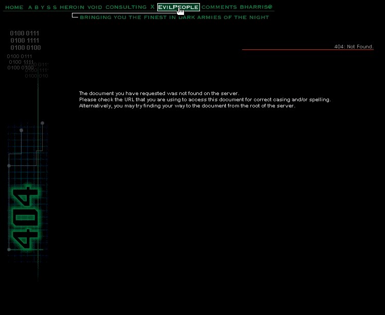
www.psyklone.com Has a mock intrusion 404 page showing that files are being removed from the intruder's machine. Graphical 404. No 404 text mentioned. No links to help the lost user. Elfwood A very well crafted graphic showing a wooded area with a fairy, and includes the classic 404 in it. Contains a link to get the user back to the front page. Screen shot. Email entry.
gaijin.com Graphical 404 error page. Contains a drop down menu at the top of the page to help the lost user. Has two 404 graphics. Has been on the top of the main list long enough. Screen shot. Email entry.
3D Realms. Great 404! Changes images with each hit or refresh. Has images of current and past employees, slightly altered. 404NORD - Page Not Found in the page. Screen shot. Email entry.
The Dismembered Youth Crops! Has the 404. Has a graphic of a really shocked individual. Two links to help the lost user. Screen Shot. Email entry.
Scriba Org Graphical 404 page, showing someone having a nightmare (they must have hit an ugly 404 page in their dream). Large yellow 404 in image with several other reasons why the person in the image is in dismay. Links to help the lost one. Screen shot Email entry.
GlassDog World Domination Headquarters Its Big! Its graphical! And its a 404 page! No actual 404 on the page, but a "Four Oh Four, Baby!" in the title. Check out the headquarters as well. Email entry, thanks! April 1999. Screen Shot. Flab Jab! Its small and has a single image stating & You are lost. (get found) & Clicking on the graphic sends the user to the main page. This error page has the classic 404 in the title. Screen shot. Email entry.
spacegirl Very bright 404 page stating "you in the wrong place at the wrong time." If you look good, you can see the faint, large 404. Something to look at in the morning to awake up. Clicking on the 404 sends the user to the main page. Screen Shot. darksquirrel.com Nice, clean, large graphically 404 page. No links for the lost user, but page will send one to the main page after 15 seconds. There is also a link to send email, move mouse over the dark squirrel. Screen shot. Email entry.
Geek Core Shows ahhhh, I guess a geek. His appearance is something like a "Kilroy was here" drawing, with bulging eyes. screen shot Email entry.
Burning Man Although I have never been there, I like the animated graphic and the BUMMER. I think a burning 404 would look nice! screen shot Gillian Anderson Estrogen Brigade Has the classic 404 error in graphical format. Has a picture of one of the stars. Clean with one link back to the front page for those that are lost and looking for the truth. Screen shot Email entry.
Big Mister C This page has a very large, green, could be mean, 404 graphic. Ok, so sometimes bigger is better (wide too). Anyway, links for the lost user, clean 404. I like it. Screen Shot. Email entry.
JTHZ Productions Very large graphical 404 page. Would explain more, but you just need to see it. Email entry. Screen Shot. Email entry.
Linux.com Large graphical 404 with everyone's, well almost everyone's, favorite penguin. Search field to help the lost user with link back to front page. superbad.com Although not a very helpful 404 page, its interesting "HTML" art. No 404, but I like it. screen shot things imagined Has a graphical 404 with the classic number included. Has an image of a fax machine in which the buttons are rollovers and links to other areas on the page. Very useful for the lost ones. Screen Shot. Email entry.
EarthCam. Has a graphical 404 page. A useful link to their front page to help the lost user. 404 in the title window. Screen Shot Modern Gypsy Very nice graphical 404. An OOPs! to the lost user with several links to get the lost one on their way. Screen capture. Email entry.
paradigm.nu This page is dedicated to the "The Ballad of Code 200". A good read and 404. Has the classic 404 in the text, javascript rollover navigation graphics to help the lost traveler. Nice clean page. screen shot. Email entry.
SJ Games No 404, but each time you hit the page a different text appears stating what might have happened to the missing page. email entry.
Bethany College. Has the classic 404 and someone I remember growing up with during my childhood. Screen capture. Phrantic's Trailerpark Great page. Lots of graphics, the 404, and links out of your abandoned trailer. Unfortunately, this page is no longer available. Check out the screen shot of this lost page. Email entry.
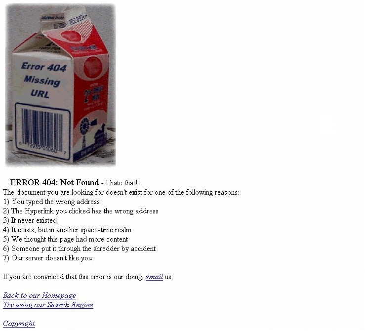
Power and Data Technology Inc. Continuing in the milk carton 404 theme. Contains the ever useful 404 error with some helpful tips. Nice image of the milk carton. Screen shot. Email entry!
The Real Beer Page. Has graphics and form entries. Does not contain the classic 404, but just File Not Found. But this is made up for in the FREE virtual beer. Screen shot. Friend entry!
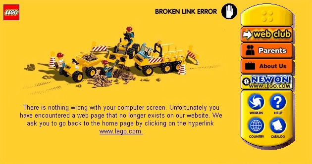
JavaSoft This 404 has improved! Lots of graphics, a graphical 404, a java applet, and links to help ya out. I like it. Screen shot. Lego. Does not have the classic 404 in the page, but in the title bar. Shows a construction crew made out of Legos working on the problem. Toolbar on the right side, a plus, to aid the lost user. Screen Shot. Email entry.
Florida Online A simple page. Has the 404 and a graphic of the milk carton. Screen shot. Email entry.
squishymatter Nice, clean, simple 404 page. Javascript mouse rollovers to make selections, "squishy." Links to help the lost user. Screen shot. Afterdinner. No classic 404 shown, but interesting and distrubing at the same time. I like it!!! Just take a look. Screen shot. Email entry.
mesmerized.org Nice, simple, graphical 404, page, with links for the lost traveler. Like it. screen shot. Bethany College Has the classic 404. Not much to help the lost user. It is an oldie, but a goodie. Oh no.... Screen shot. Friend entry.
snark.co.il The 404 in the page and in the title. Has, what looks to be, an old women from a classic movie asking "O, are we lost, Dear?" There is a link to the front page. If you got time, take a look at that front page. Screen shot. brutal.comHas a bunny that changes position with every hit. cold-dead-fish.com Has a harsh 404 page, stating that you are an idiot. Email entry.
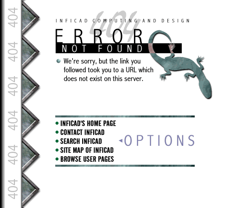
Allusive.Net Has a graphical 404 image. Nice background image. Rest of page interesting! screen shot Inficad Computing and Design - Once lost, but now back. Lots of graphics and the classic 404. Thanks Christopher! Screen shot. zug.com Pages shows some other things that are missing besides this page. Contains links for the lost user.  Email entry. Email entry. |

Non-internet 404. Took the car in to get repaired and this is the number they gave. Somehow they knew? |
The Quest! (a.k.a Why?) |
Best 404s |
The Main 404 Listing |
Outta here! |
Libellés : 404, error, how traffic rank works, info, traffic rank, xoops.net.br
publié par mikhail | dimanche, avril 04, 2004 | 0 commentaires, Liens vers ce message blog,
Turbinado pelo XOOPS Cube em portuguêsXOOPS Cube International : english | dutch | german | greek | russian
french |xoopserver | japanese | korean | traditional chinese | | peak.ne.jp/ | xoopscube.eu
//]]> --->