Choice Groups
A choice group is a set of selectable elements within a form. There are three types of choice groups:
- Exclusive choice: Allows a single choice from among elements that are always accessible. This is much like the exclusive-choice list, except that the list is a full-screen component. See "Exclusive-Choice Lists" on page 45 for advice on enabling a user to make a single selection from a group of elements.
- Pop-up choice: Allows a single choice from among items that, except for the selected element, are hidden until the user performs a device-specific action to show them. This kind of choice group does not have a full-screen counterpart.
- Multiple choice: Allows a user to choose zero or more elements. This kind of choice group is much like a multiple-choice list, except that the list is a full-screen component. See "Multiple-Choice Lists" on page 47 for advice on enabling a user to make multiple selections from a group of elements.
|
app Developer Responsibilities |
MIDP Implementor Responsibilities |
|---|---|
|
|
app Developers
Consider: You can insert, delete, update, and set the selection of a choice group as needed. You can also add, update, or delete the choice group's label as needed. Try to make these changes only when the form is not visible or in response to a user action. Arbitrary changes to visible screens are confusing to users.
Strongly Recommend:
Provide labels for choice groups. Have the labels tell users what they need to do with the choice group.
Recommend:
Use a pop-up choice group when the user does not need to see all of the options all the time. You can also use a pop-up choice group for long lists of options because hiding all but the selected element saves screen real estate.
Recommend:
MIDP Implementors
Strongly Recommend:
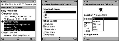
Screenshot Presentations for Different Kinds of Choice Groups
Consider: You are permitted to use different visual representations for choice-groups and their full-screen counterparts, or the same visual representations. Having different looks is sometimes necessary to fit in with the native look-and-feel of the device. Having the same look makes the app more predictable. Screenshot shows a choice group and its full-screen counterpart that have the same visual representation.
Screenshot Exclusive-Choice on a Form and in a Screen
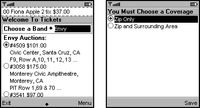
Other recommendations for using choice groups are the same as the recommendations for using lists, their screen counterparts. (See for more information.)