| Previous | Next
Altering the Highlight RectangleThe highlight rectangle is normally displayed with a thickness of 2 pixels.[13] This can be changed using the
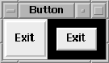
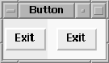
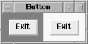
-highlightthickness => The amount specified is any valid screen distance. In Figure 4-38, the Exit Button on the right has a Figure 4-38. Example of -highlightthickness => 10When the Button doesn't have the keyboard focus, a small space is left around it. If this extra space bothers you, you can set The color of the highlight rectangle can also be changed. There are two values for this: the color of the highlight rectangle when the Button does not have the focus and the color of the highlight rectangle when it does have the focus. The option -highlightcolor => Figure 4-39 shows the right Button with the focus and with Figure 4-39. Example of Button with -highlightcolor => 'yellow'To change the color of the space left around the Button when it doesn't have the focus, use the option -highlightbackground => Normally, the highlight rectangle is the same color as the background of the window, which allows it to blend in with the background of the window or Frame that contains the Button. Figure 4-40 shows an example where both Buttons have the following configuration: -highlightcolor => 'blue', -highlightbackground => 'yellow' The left Button has the focus. Figure 4-40. Button with -highlightcolor => 'blue' and -highlightbackground => 'yellow' |