Creating Small, Informative Graphs with SparklinesProblemYou need to display data as part of a body of text, or within a small amount of screen real estate. To give this data some context, you want to include a small graphic representation, as well as display a numeric value. For example, in addition to saying "The value of the DJIA is 1234.56," you'd like to show a graph showing how it's varied during the past year. SolutionSparklines are a simple, condensed way to present trends and variation, graphically. They are very small graphs that are usually placed very close to a piece of data, letting the reader get a better idea of how that piece of data fits into a larger set. The sparklines and sparklines_generator gems help you create these graphs for use within your Rails application. To get started, install the sparklines gems: $ sudo gem install sparklines ... $ sudo gem install sparklines_generator For sparklines to work, you need the RMagick image library tools installed on your system. See Section 15.1" for more on that. In your application, run the sparklines generator to create a controller and helper for naming sparklines. $ ruby script/generate sparklines create app/controllers/sparklines_controller.rb create app/helpers/sparklines_helper.rb Include the sparklines library into your application by adding the following to the end of config/environment.rb: require 'sparklines' Then, in your controller, make the sparklines helper available by calling the helper method, passing it :sparklines. For example, here's a ReportsController that does just that: class ReportsController < ApplicationController helper :sparklines def index end end When you include the sparklines helper in your controller, it generates a sparkline_tag view helper that's available inside views rendered from that controller. To use the sparkline_tag helper, pass it an array of integers and an options hash. The options hash should have a key of :type. The value for this key specifies one of four types of graphs: Here's how to create each graph type (each is called from app/views/reports/index.rhtml). The following RHTML creates a continuous black line graph, 20 pixels high: <p> smooth: <%= sparkline_tag [1,3,4,5,4,6,7,9,20,13,15,17,26, 26,14,9,5,26,10,16,26,24,52,66,39], :type => 'smooth', :height => 20, :step => 2, :line_color => 'black' %> </p> The :step option controls the dimensions of the Y axis. The following creates a line graph composed of individual bars: <p> discrete: <%= sparkline_tag [1,2,3,3,3,4,5,6,7,8,8,8,9,10], :type => 'discrete', :height => 20, :step => 3, :upper => 40, :below_color => 'grey', :above_color => 'black' %> </p> The :upper option is a percentage that specifies how far through the range of values in your dataset to create a boundary. Points above the boundary can be one color and those below, another. Now for a pie chart: <p> pie: <%= sparkline_tag [30], :type => 'pie', :diameter => 30, :share_color => 'black', :remain_color => 'grey' %> </p> The dataset consists of a single integer, which is the percentage (or share) of the circle to highlight. You specify the color of that share, as well as the color of the remainder of the graph, you control the size of the rendered graph with :diameter. <p> area: <%= sparkline_tag [1,3,5,7,11,13,17,22,31], :type => 'area', :height => 30, :step => 3, :upper => 30, :below_color => 'grey', :above_color => 'black' %> </p> This code creates a line graph with a visible y axis, where the region below the line and this access is filled in with a color. The y axis occurs at a point in the range of values in your dataset as specified by the :upper option (a percentage). Control the size of the graph with :height and :step. Use :upper to determine at what point (a percentage) the region should be the color specified by :above_color and :below_color. DiscussionSparklines are "intense, simple, wordlike graphics" that are used to reinforce a data value being introduced in some text. The technique was invented by Edward Tufte, an expert in data visualization theory and practice. A sparkline might be used to represent a patient's blood pressure in an automatically generated summary. The blood pressure might be listed next to a small sparkline that shows how that value has risen or fallen throughout the past month or week. This gives the doctor much more information about the context of the current blood pressure level, which might make a significant difference in his conclusions about the patient's current situation. Figure 15-4 shows the rendering of each graph type from the solution's example. (I've purposely made them larger in this example for clarity.) Figure 15-4. A page containing four different types of graphs made using sparklines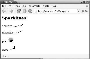
See Also |