Buttons and Hyperlinks
Both string and image items have an appearance mode attribute. Table 8.1 shows the attribute values, along with screen shots and short explanations.
Table 8.1. Appearance Modes
|
Attribute Value |
Screen Shot |
Description |
|---|---|---|
|
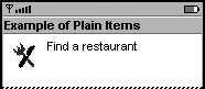
PLAIN |
|
Default mode, typically used for noninteractive display of textual or graphical material. |
|
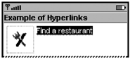
HYPERLINK |
|
Requests that the device display the item contents as if the item were a hyperlink in a browser. |
|
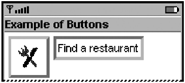
BUTTON |
|
Requests that the device display the item contents as if the item were a button. |
MIDP Implementors
Strongly Recommend:
Display the hyperlink and button appearance modes in a way that is consistent with their purposes. The appearance mode should be an indication to the user whether the item is interactive. If an app requests a button or hyperlink appearance mode, but does not assign a command to the item, display the item as though it had a PLAIN appearance mode.
Hyperlink Appearance Mode
The hyperlink appearance mode should be similar in use to a web link. It can take the user to a new screen in the same way, conceptually, that a web link takes the user to a new page. Unlike a web link, however, an item with a hyperlink cannot take the user outside the MIDlet.
app Developers
Strongly Recommend:
Recommend:
An item with hyperlink appearance mode should have one or more item-specific abstract commands associated with it. Without at least one associated command, the item is not interactive and a device might not display the item as a hyperlink.
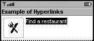
Usability studies showed that an underline is helpful to indicate a hyperlink state, but merely underlining a hyperlink was not enough to indicate to users that a hyperlink had focus. Without an additional focus indicator, the user may not know that the link is selectable.
MIDP Implementors
Consider: Use a highlighting method, such as reverse video, to indicate when a hyperlink has focus. Screenshot shows two hyperlinks, one with reverse-video to indicate it has focus.
Screenshot Hyperlink String When It Has Focus
Button Appearance Mode
The button appearance mode should be similar in use to a button on a web page: It should enable the user to carry out a command or operation. The button appearance mode should not take the place of abstract commands.
app Developers
Strongly Recommend:
Recommend:
Consider: Remember that in traversal-based devices, such as many mobile phones, users must navigate to a button before they can use it. If all of the fields preceding a button require a user's attention or interaction, users will not be inconvenienced by the navigation; a button could be appropriate. If, however, a button is at the end of a long form that includes optional items, traversing to the button could make the form seem cumbersome, and users could miss the button.
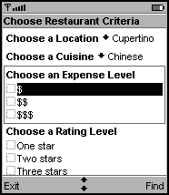
There are a few alternatives that app designers can consider instead of putting a button at the end of a long form. One alternative is to attach the command to the form itself. (See for more information on commands associated with screens.) Attaching the command to the form places the command in a place that is always immediately accessible to the user. Screenshot shows an example command, Find, attached to the form.
Screenshot Form without a Button
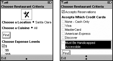
Another alternative is to have two buttons on the form that perform the action. Place one button immediately after the required information, and the other after the optional information at the bottom of the form. Screenshot shows an example of this type of form.
Screenshot Form with Two Buttons
app Developers
Recommend:
There are a few reasons for this advice. One reason is that devices differ from one another in critical features, such as screen size. These differences make laying out the buttons in a way that is both portable and usable across devices very difficult. Another reason is that MIDP is designed so that a device manufacturer can map abstract commands onto the device in a way that is expected by its users. This decreases the time required for the user to learn to use the MIDlet. Button-based user interfaces hamper usability by removing the device manufacturer's opportunity to unify the user experiences of MIDlets and native apps. When manufacturers are given this opportunity, users will find the device and all of its apps (MIDlets and native) both fast and predictable. Finally, scrolling or traversing to a button is much slower than activating a soft key (a common method of making abstract commands available to users). Attaching abstract commands to a screen instead of creating a button-based user interface can make using the form less cumbersome.
MIDP Implementors
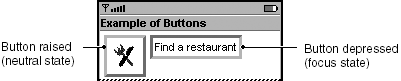
Consider: A button needs two styles for focus highlighting, one to indicate a neutral state, and another to indicate when the button has focus. The MIDP Reference Implementation uses a 3-D style that looks like a raised button when it does not have focus, and a depressed button when it has focus. Screenshot shows these button styles.
Screenshot Neutral and Focus States of Button Items
Consider: Do usability testing to ensure your users can distinguish a button that is in a neutral state from one that has focus. For example, if users had problems distinguishing the focus state in the button graphics shown in Screenshot, you could add additional cues for the user, such as also displaying the depressed button in reverse video.