Visualizing Google Results


The TouchGraph Google Browser is the perfect Google complement for those who appreciate visual displays of information.
![]()
Some people are born text crawlers. They can retrieve the mostly text resources of the Internet and browse them happily for hours. But others are more visually oriented and find that the flat text results of the Internet leave something to be desired, especially when it comes to search results.
If you're the type who appreciates visual displays of information, you're bound to like the TouchGraph Google Browser (http://www.touchgraph.com/TGGoogleBrowser.html). This Java applet allows you to start with the pages that are similar to one URL, and then expand outward to pages that are similar to the first set of pages, on and on, until you have a giant map of "nodes" (a.k.a. URLs) on your screen.
Note that what you're finding here are URLs that are similar to another URL. You aren't doing a keyword search, and you're not using the link: syntax. You're searching by Google's measure of similarity.
Starting to Browse
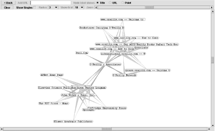
Start your journey by entering a URL on the TouchGraph home page and clicking the "Graph It" link. Your browser will launch the TouchGraph Java applet, covering your window with a large mass of linked nodes, as shown in Figure 6-4.
Figure 6-4. Mass of linked nodes generated by TouchGraph
|

If you're easily entertained like me, you might amuse yourself for a while just by clicking and dragging the nodes around. But there's more to do than that.
Expanding Your View
Hold your mouse over one of items in the group of pages. You'll notice that a little box with an H pops up. Click on that and you'll get a box of information about that particular node, as shown in Figure 6-5.
Figure 6-5. Node information pop-up box
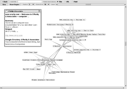
The box of information contains title, snippet, and URL - pretty much everything you'd get from a regular search result. Click on the URL in the box to open that URL's web page itself in another browser window.
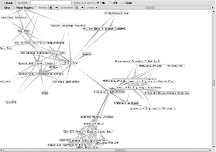
Not interested in visiting web pages just yet? Want to do some more search visualization? Double-click on one of the nodes. TouchGraph uses the API to request from Google pages similar to the URL of the node you double-clicked. Keep double-clicking at will; when no more pages are available, a green C will appear when you put your mouse over the node (no more than 30 results are available for each node). If you do it often enough, you'll end up with a whole screen full of nodes with lines denoting their relationship to one-another, as Figure 6-6 shows.
Figure 6-6. Node mass expanded by double-clicking on nodes
Visualization Options
Once you've generated similarity page listings for a few different sites, you'll find yourself with a pretty crowded page. TouchGraph has a few options to change the look of what you're viewing.
For each node, you can show page title, page URL, or "point" (the first two letters of the title). If you're just browsing page relationships, the title's probably best. However, if you've been working with the applet for a while and have mapped out a plethora of nodes, the "point" or URL options can save some space. The URL option removes the www and .com from the URL, leaving the other domain suffixes. For example, www.perl.com will show as perl, while www.perl.org shows as perl.org.
Speaking of saving space, there's a zoom slider on the upper-right side of the applet window. When you've generated several distinct groups of nodes, zooming out allows you to see the different groupings more clearly. However, it also becomes difficult to see relationships between the nodes in the different groups.
TouchGraph offers the option to view the "singles," the nodes in a group that have a relationship with only one other node. This option is off by default; check the Show Singles checkbox to turn it on. I find it's better to leave them out; they crowd the page and make it difficult to establish and explore separate groups of nodes.
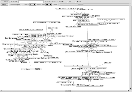
The Radius setting specifies how many nodes will show around the node you've clicked on. A radius of 1 will show all nodes directly linked to the node you've clicked, a radius of 2 will show all nodes directly linked to the node you've clicked as well as all nodes directly linked to those nodes, and so on. The higher the radius, the more crowded things get. The groupings do, however, tend to settle themselves into nice little discernable clumps, as shown in Figure 6-7.
Figure 6-7. Node mass with Radius set to 4
A drop-down menu beside the Radius setting specifies how many search results - how many connections - are shown. A setting of 10 is, in my experience, optimal.
Making the Most of These Visualizations
Yes, it's cool. Yes, it's unusual. And yes, it's fun dragging those little nodes around. But what exactly is the TouchGraph good for?
TouchGraph does two rather useful things. First, it allows you to see at a glance the similarity relationship between large groups of URLs. You can't do this with several flat results to similar URL queries. Second, if you do some exploration you can sometimes get a list of companies in the same industry or area. This comes in handy when you're researching a particular industry or topic. It'll take some exploration, though, so keep trying.
TouchGraph Google Browser created by Alex Shapiro (http://www.touchgraph.com/).
« Previous Next »