Rating the Layout of the Page/Use of Space on the Page
Use of space refers to the position of and the amount of space on the page dedicated to MC, SC, and Ads. You will rate on this scale:
• misleading or deceptive
• poor
• so-so
• good
• excellent
The page should be designed and organized to achieve its purpose. While every page is different, pages that use space effectively should have these characteristics:
• The MC should be prominently displayed and "front and center." The MC should be immediately visible when a user opens the page.
• It should be very clear what the MC actually is. The page layout, organization and use of space, as well as the choice of font, font size, background, etc., of the page should make this clear.
• The MC and SC together should take up most of the space on the page.
• Ads and SC should be arranged so as not to distract from the MC.
• It should be clear what parts of the page are Ads, either by explicit labeling or simply by page layout.
Some pages are "prettier" or more professional looking than others, but you should not rate based on how "nice" the page looks. Pages can have lovely images, a pretty background, or a professional "look," but fail to achieve their purpose. Low Quality Page with Poor Use of Space
has a nice image at the top, but otherwise the use of space is poor: the MC is placed below many Ads (and note that the MC is also low quality). Here is an example of a very low quality page that looks professional:
Low Quality Page with Good Use of Space
.
On the other hand, a page can be very functional, use space well, and achieve its purpose without being "pretty": High
Quality Page with Good Use of Space, but Not Pretty
.
Like everything else, good layout and use of space depends on the purpose of the page. What constitutes good page layout for a shopping page may be very different from what constitutes good page layout for an information page.
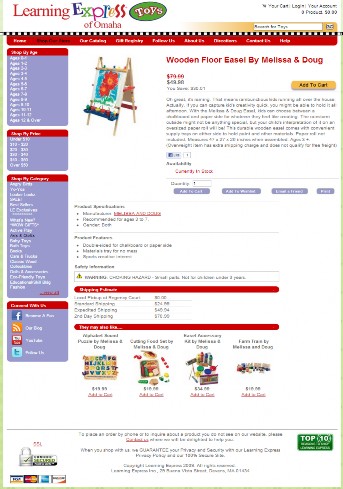
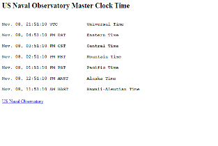
Consider these two pages. The shopping page on the left has good layout and use of space for its purpose, which is to sell a child's easel. The page on the right also has good layout and use of space for its purpose, which is to display the current time in different time zones. Both pages have excellent page layout and use of space for their purpose even though they look very different and the page on the right has little SC.
|
Learning Express Shopping Page |
US Naval Observatory Master Clock Time Page |
|
|
Notice that the page layout in the example on this side is very clean and the information is displayed in a highly functional way. The only SC is a link, which gives users additional information about the source of this displayed content. This page achieves its purpose well and is high quality. |
You must think about the purpose of the page and whether the page layout allows the page to achieve its purpose.
Let's look at a few other examples. Please note that we are only discussing the use of space in these examples. The first three examples are Low or Lowest quality pages.
|
Use of Space Rating |
Use of Space Example |
Explanation |
|
misleading or deceptive |
Advertising should never disguise itself as the MC of the page. Pages with Ads that are designed to look like MC should be considered deceptive. | |
|
poor |
Advertising should never make it very difficult or impossible to find or use the MC. In this example, some users might not even notice the MC because it is under a long list of Ads. A lot of scrolling is required to see the MC. | |
|
poor |
This example has mildly deceptive layout. This is a download page, so the download text and links are the MC. But the large green "Download now" button at the top is an Ad. Users could easily click on that button without realizing that it is an Ad and not part of the MC. | |
|
Good |
At first glance, it appears that this page has little MC and that the page was created with little effort. However, close inspection of the page and consideration of the purpose of the page reveal that this page has good layout and use of space for its purpose, which is to display the official US Naval Observatory Master Clock time in 7 different time zones. No additional content is needed, and the page displays the clock information in a clear, easy-to-read format. Users interested in this information would be happy with the page layout. |

Use of Space Examples for Q&A Pages
Here are some examples for Q&A (question and answer) pages. Q&A pages with good use of space should devote much or most of the space to the questions and answers, and the layout/use of space should make the question and the answers clear. Good layout might also help users understand at a glance how many answers there are and which are the best answers, as well as clearly highlight the author and the dates of the answers. The SC should play a supporting role on the sides of the page, and Ads should be clearly distinguished from the SC and the answers.
|
Use of Space Rating |
Use of Space Q&A Example |
Explanation |
|
misleading or deceptive |
The use of space in this example is poor or even deceptive. The Ads and SC take up most of the space. The page also uses the same "look" (color, font, and layout of the text), both for answers to the question and for the Ads/links, making it very difficult to distinguish which are answers to the question and which are Ads. (There are other aspects of this page which make it overall Lowest quality: there are no features for users to rate the answers, and the page is overwhelmed by Ads and links.) | |
|
poor |
This is another example of a Q&A page that has poor use of space. This question does not have an answer, but it might take you a while to realize this. The page has a lot of SC and Ads, much of which is shown where you would expect answers to be displayed. There is a section called "Relevant answers," but in fact these are pages from the same website with different questions, many of which are actually unrelated to this question. The "Relevant answers" section should be considered SC. Compare the page to this example used earlier: MC Q&A Unsatisfying Quantity
| |
|
good |
This is an example of good layout and good use of space on a Q&A page, It's very clear what each part of the page is. The question is immediately visible, the authors are next to the questions and answers, all responses are dated, and the answers are sorted according to user feedback so that the best answer is at the top, immediately following the question. Note: The overall PQ rating for this page is Medium. |

Note: Invasive pop-ups or large flashing/animated/distracting Ads that cannot easily be closed are an example of poor use of space because they take attention away from the MC. Here is an example of a page with a pop-up that cannot be closed: Annoying Pop-Up
This page is considered "misleading or deceptive" and should get an overall PQ rating of Lowest.
« Previous Next »

