Adding tree controls
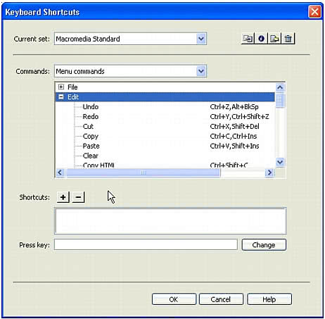
Tree controls display data in a hierarchical format and let users expand and collapse nodes in the tree. The MM:TREECONTROL tag lets you create tree controls for any type of information; unlike the database tree control that is described in Adding a database tree control, no association with a database is required. The Adobe Dreamweaver Keyboard Shortcuts editor uses the tree control, as shown in the following figure:
Creating a tree control
The MM:TREECONTROL tag creates a tree control and can use one or more tags to add structure, as described in the following list:
MM:TREECOLUMNis an empty, optional tag that defines a column in the tree control.MM:TREENODEis an optional tag that defines a node in the tree. It is a nonempty tag that can contain only otherMM:TREENODEtags.
MM:TREECONTROL tags have the following attributes:
Attribute name | Description |
|---|---|
name | Name of the tree control |
size | Optional. Number of rows that show in the control; default is 5 rows |
theControl | Optional. If the number of nodes in the |
multiple | Optional. Allows multiple selections; default is single-selection |
style | Optional. Style definition for height and width of tree control; if specified, takes precedence over the |
noheaders | Optional. Specifies that the column headers should not appear |
MM:TREECOLUMN tags have the following attributes:
Attribute name | Description |
|---|---|
name | Name of the column |
value | String to appear in column header |
width | Width of the column in pixels (percentage not supported); default is 100 |
align | Optional. Specifies whether the text in the column should be aligned left, right, or center; default is left |
state | Specifies whether the column is visible or hidden |
For readability, TREECOLUMN tags should follow immediately after the MM:TreeControl tag, as shown in the following example:
<MM:TREECONTROL name="tree1"><MM:TREECOLUMN name="Column1" width="100" state="visible"><MM:TREECOLUMN name="Column2" width="80" state="visible">... </MM:TREECONTROL>
The MM:TREENODE attributes are described in the following table:
Attribute name | Description |
|---|---|
name | Name of the node |
value | Contains the content for the given node. For more than one column, this is a pipe-delimited string. To specify an empty column, place a single space character before the pipe (|). |
state | Specifies that the node is expanded or collapsed with the strings |
selected | You can select multiple nodes by setting this attribute on more than one tree node, if the tree has a MULTIPLE attribute. |
icon | Optional. The index of built-in icon to use, starting with 0: 0 = no icon; 1 = DW document icon; 2 = Multidocument icon |
For example, the following tree control has all its nodes expanded:
<mm:treecontrol name="test" style="height:300px;width:300px"><mm:treenode value="rootnode1" state="expanded"><mm:treenode value="node1" state="expanded"></mm:treenode><mm:treenode value="node3" state="expanded"></mm:treenode></mm:treenode><mm:treenode value="rootnode2" state="expanded"><mm:treenode value="node2" state="expanded"></mm:treenode><mm:treenode value="node4" state="expanded"></mm:treenode></mm:treenode></mm:treecontrol>