| Previous | Next
Displaying an Image or BitmapThe simplest way to replace the text on your Button with an image is to use a bitmap.[11] The image will take the place of the text; you can't display both at the same time. The
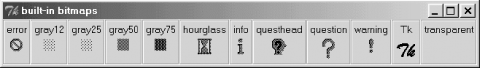
-bitmap => ' There are several built-in bitmaps: Using $mw->Button(-bitmap => 'error', -command => \&handle_error)->pack; To specify a bitmap from a file, you need to put an
Note that if you use double quotes, you have to escape the Figure 4-7. Window showing all the default bitmapsIf you don't want to use a bitmap, or have a different format of file (such as a GIF), you can use the
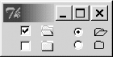
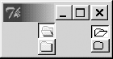
When using an image, only the image will be displayed, because Buttons can display either a text string or an image, not both. (In other words, Images are covered in extensive detail in "Images and Animations". Figure 4-8 shows an example of a Button with a GIF file on it. Figure 4-8. Button with an image instead of textImages with Checkbuttons and RadiobuttonsYou can also use the # Create Photo objects with gif files $folder = $mw->Photo(-file => "folder.gif"); $openfolder = $mw->Photo(-file => 'openfolder.gif'); $leftframe->Checkbutton(-image => $folder, -selectimage => $openfolder)->pack(-expand => 1); $leftframe->Checkbutton(-image => $folder, -selectimage => $openfolder)->pack(-expand => 1); # Create Bitmap objects with bitmap files $bmpopen = $mw->Bitmap(-file => 'openfolder.xbm'); $bmpfolder = $mw->Bitmap(-file => 'folder.xbm'); $rightframe->Radiobutton(-image => $bmpfolder, -selectimage => $bmpopen, -variable => \$vvv, -value => 1)->pack(-expand => 1); $rightframe->Radiobutton(-image => $bmpfolder, -selectimage => $bmpopen, -variable => \$vvv, -value => 2)->pack(-expand => 1); Figure 4-9 shows the resulting window. Figure 4-9. Using both -image and -selectimageYou'll notice in this example that in addition to the image changing when you click on the Checkbutton, there's also a selection indicator. If this seems redundant, that's because it is: the selection indicator is unnecessary when using Figure 4-10. Using Checkbuttons and Radiobuttons with -indicatoron => 0Both Checkbuttons and Radiobuttons look much like Button widgets with the indicators turned off, but their behavior is very different. In Figure 4-10, the very top two widgets are selected (just as in Figure 4-9). When selected, a Checkbutton will stay down (a relief of |